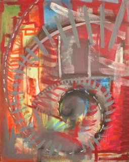
It is a running record of the creative process. (Images are purposely degraded then compressed to help protect intellectual property.)
Thursday, June 29, 2006
Wednesday, June 14, 2006
falling water flowing water drawing water


Searching for a balance between the seeming solidity and force of moving water and the reality that it is a soft interlacing of molecules who's attraction to each other is not tenacious but persistant. A colorless liquid that adopts the color of its current suspension as well as the reflected light of it surroundings.
Thesis installation views
This is how I set up my show for my thesis in April 2005. I had changed directions radically just 5 weeks before this show. Wishing I had more time, but realizing that I did not, I spent at least one all nighter each week leading up to this installation painting and planning. I think that the motion in each piece reflects that frantic rush to express something.
 The paintings were hung very high making viewing them a bit uncomfortable. (the bottom of the paintings are about 48" off the floor) The mood of this corner was fast and turbulent. A perfect reproduction of the impression of floating in the middle of a raging river. ALMOST over your head, but still manageable.
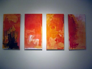 It was fun to watch everyone gravitate towards this painting, which I call "seduction". It still has the motion, turbulence, and speed of a churning river, but the colors leaned a little more to the pastel side. It is like reflected sunrise. The motion is one type of peak experience, and the color is another; the kinesthetic effect that sunrise colors have on me.
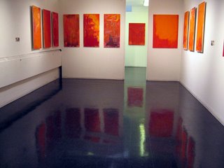
These were the most high-key, brightest, most annoying paintings. Again, hung high so it feels like they are going to fall on the viewer. I noticed that people didn't want to get too close to them. It was perfect. They blocked the way out. Like running a river in my boat, the audience has to pass by some unsettling things to find a way through to the calm of the prints in the lobby.
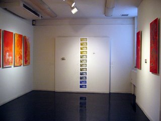
This was in the back, and what drew people in. A small slice of the color spectrum that promises to be pleasant and fun. Non threatening, allowing curiousity.
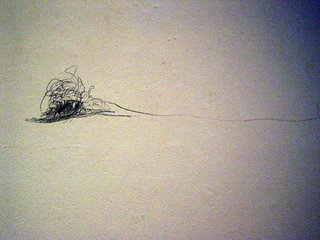
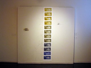 It's really a waterfall of prints (which are a bird's eye/ boater's eye view of a waterfall). Upon closer inspection, the nice colors are betrayed (or "balanced" as one person said) by the frenetic motion within each image. Additionally, frantic pencil marks are scrawled on the wall that mimick the speed of falling water.
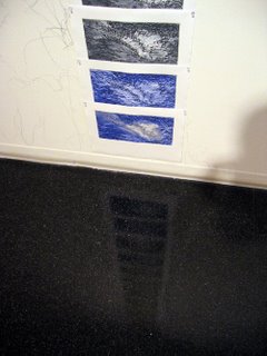
 I made sure that the floor was really clean under this piece so the available reflection would evoke both a calm pool of water and an implied continuation beneath the surface. We see water fall, then plunge into a pool, but do not realize just how deep it can go.
 The paintings were hung very high making viewing them a bit uncomfortable. (the bottom of the paintings are about 48" off the floor) The mood of this corner was fast and turbulent. A perfect reproduction of the impression of floating in the middle of a raging river. ALMOST over your head, but still manageable.
 It was fun to watch everyone gravitate towards this painting, which I call "seduction". It still has the motion, turbulence, and speed of a churning river, but the colors leaned a little more to the pastel side. It is like reflected sunrise. The motion is one type of peak experience, and the color is another; the kinesthetic effect that sunrise colors have on me.
These were the most high-key, brightest, most annoying paintings. Again, hung high so it feels like they are going to fall on the viewer. I noticed that people didn't want to get too close to them. It was perfect. They blocked the way out. Like running a river in my boat, the audience has to pass by some unsettling things to find a way through to the calm of the prints in the lobby.

This was in the back, and what drew people in. A small slice of the color spectrum that promises to be pleasant and fun. Non threatening, allowing curiousity.
 It's really a waterfall of prints (which are a bird's eye/ boater's eye view of a waterfall). Upon closer inspection, the nice colors are betrayed (or "balanced" as one person said) by the frenetic motion within each image. Additionally, frantic pencil marks are scrawled on the wall that mimick the speed of falling water.
 I made sure that the floor was really clean under this piece so the available reflection would evoke both a calm pool of water and an implied continuation beneath the surface. We see water fall, then plunge into a pool, but do not realize just how deep it can go.
Corciano light
My first semester in grad school was spent in Corciano, Italy.
The light in September is absolutely INCREDIBLE. I lost my mind and all the intended ideas I had, and just surrendered to it. I had been looking for this for a long time.
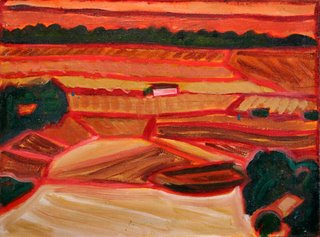 I always painted at sunset or sunrise, watching the colors erupt from the earth as the sun hit the redorangepink level.
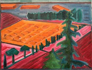 Low sun inthe snow mountains makes a beatiful effect of "alpenglow". In Corciano, there was a similar effect on objects, but not with winter sun. It was with late summer sun that wrapped around everything it touched.
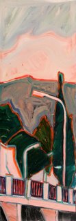
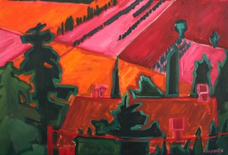
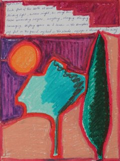
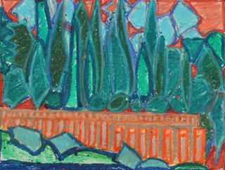
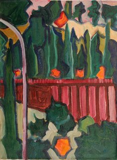 There were a few olive trees that were different from the others. I could not tell if they were dying, or if they were picked too early, or something else all together. In the rising sun they formed a rudimentary cross. The red wall holds back the earth, atop of which rests a monastary. The gray-purple steel lamp post on the left framed the cypress tree, as if it were half of a composition in an altar piece. (notice the gothic arch shape to the lap post) Olive branch, cross, monastary, gothic arch shaped altar piece. It just had to be painted here, in the former Roman Empire. (could the yellow in the back be Elysian fields?)
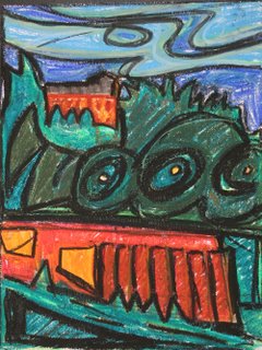 We had a windy night, a little while before I saw the monastary cross.
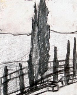
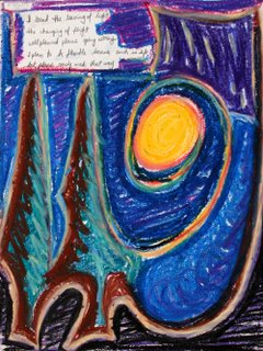
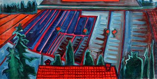
Late in the semester, mid Fall, the light had changed. But, it would still shine brilliantly off the water that lay in the fields. It lay in rows, between plowed mounds, and relected the rose sunset, while the ambient light cooly circled everything else.
The light in September is absolutely INCREDIBLE. I lost my mind and all the intended ideas I had, and just surrendered to it. I had been looking for this for a long time.
 I always painted at sunset or sunrise, watching the colors erupt from the earth as the sun hit the redorangepink level.
 Low sun inthe snow mountains makes a beatiful effect of "alpenglow". In Corciano, there was a similar effect on objects, but not with winter sun. It was with late summer sun that wrapped around everything it touched.

 There were a few olive trees that were different from the others. I could not tell if they were dying, or if they were picked too early, or something else all together. In the rising sun they formed a rudimentary cross. The red wall holds back the earth, atop of which rests a monastary. The gray-purple steel lamp post on the left framed the cypress tree, as if it were half of a composition in an altar piece. (notice the gothic arch shape to the lap post) Olive branch, cross, monastary, gothic arch shaped altar piece. It just had to be painted here, in the former Roman Empire. (could the yellow in the back be Elysian fields?)

 We had a windy night, a little while before I saw the monastary cross.


Late in the semester, mid Fall, the light had changed. But, it would still shine brilliantly off the water that lay in the fields. It lay in rows, between plowed mounds, and relected the rose sunset, while the ambient light cooly circled everything else.
learning the art of whitewater (linocut)
Simply the art of learning whitewater kayaking and block cut printing. I had an introductory course in each and this is the point at which I needed to spend some time just practicing what I had learned. It's the best way to become competent at any new skill. All of this work is around 1995
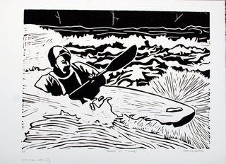 I'm working towards a dialogue about the motion of water, the speed, fluidity, depth, and overlapping layers. Transparency is not yet an issue because in whitewater you have to read the folds of the surface to make your best guess at what is happening beneath. The sediment and froth make the water relatively opaque.
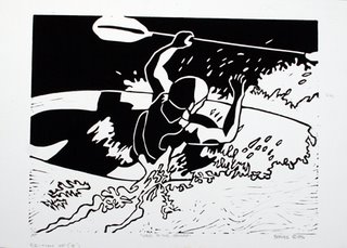 "Wave to the Camera" This is done from a photo. We were at a spot that gave us "enders" (a trick in which your boat gets stood up on end and you pop up into the air for a moment) Honestly, my hand had slipped off the paddle, but I recovered. The water was warm and we were having a wonderful time. It was just pure fun. So, I decided to really give the print a fun look. Fun, at the time, also meant graphic novels. Therefore, I used super high contrast without any cross hatching. I am trying to remember if "Sin City" was published yet, but I do remember a similar aesthetic from this time....
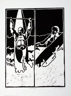 We did so many "enders" that I just had to make an image with multiple views/attempts. I thought, at one point, that the repeated cross theme meant something, but now I just think it was a useful compositional tool. Still, it does make a powerful image. There must be something to that; some reason that the cross has lasted throughout the ages (even before 2000 years ago)
 a Japanese print inspired depiction of a rapid that I had recently had my first experience on. "Stairway" I was working towards understanding how the water moved through and over the rocks in this particular section. Using this as a map, you can find your way through this rapid, avoiding the most vertical sections,and minimizing time spent in the most white "bubbly" sections. You can see three features on the right side (lower 2/3 of image) that are exceptionally vertical with lots of white at the bottom. All three spots are not friendly places to kayakers or swimmers.
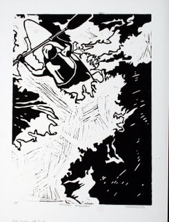
here I am setting up an "S" shaped composition. I noticed many "S" shapes in moving water. I also noticed that as I improved as a kayaker, I was carving many "S" shaped lines down the river. It is representative of a natural ebb and flow of current, tide, seasons, too many things to list.....
 I'm working towards a dialogue about the motion of water, the speed, fluidity, depth, and overlapping layers. Transparency is not yet an issue because in whitewater you have to read the folds of the surface to make your best guess at what is happening beneath. The sediment and froth make the water relatively opaque.
 "Wave to the Camera" This is done from a photo. We were at a spot that gave us "enders" (a trick in which your boat gets stood up on end and you pop up into the air for a moment) Honestly, my hand had slipped off the paddle, but I recovered. The water was warm and we were having a wonderful time. It was just pure fun. So, I decided to really give the print a fun look. Fun, at the time, also meant graphic novels. Therefore, I used super high contrast without any cross hatching. I am trying to remember if "Sin City" was published yet, but I do remember a similar aesthetic from this time....
 We did so many "enders" that I just had to make an image with multiple views/attempts. I thought, at one point, that the repeated cross theme meant something, but now I just think it was a useful compositional tool. Still, it does make a powerful image. There must be something to that; some reason that the cross has lasted throughout the ages (even before 2000 years ago)
 a Japanese print inspired depiction of a rapid that I had recently had my first experience on. "Stairway" I was working towards understanding how the water moved through and over the rocks in this particular section. Using this as a map, you can find your way through this rapid, avoiding the most vertical sections,and minimizing time spent in the most white "bubbly" sections. You can see three features on the right side (lower 2/3 of image) that are exceptionally vertical with lots of white at the bottom. All three spots are not friendly places to kayakers or swimmers.
here I am setting up an "S" shaped composition. I noticed many "S" shapes in moving water. I also noticed that as I improved as a kayaker, I was carving many "S" shaped lines down the river. It is representative of a natural ebb and flow of current, tide, seasons, too many things to list.....
2 color silkscreen portrait
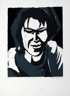
it's a self portrait, apropriate for the mood I'm in. Not doing much actual art right now,but plenty of contemplation and reflection as I organize much of my art. (this potrait is from either 1994 or 1995) Looking back is kind of fun. I can see how I've grown both as an artist and as a person. The exceptionally interesting thing is what common threads exist throughout the past decade. I suppose that is the legacy of life; those things to which we return; the subjects that either haunt us or make us feel good. Obsession has such an ugly connotation, but by flushing out the pejoratives we find that obsession is merely a repetition, a focus; one that is hopefully a companion to love (and not a substitute)
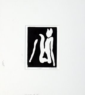
older prints
These are from my first university printmaking class.
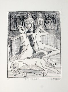
it was a printmaking survey class so we did lots of stuff and spent very little time on any single technique.
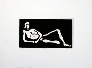
but it opened my eyes to how fun (and how seductive) strict black and white could be
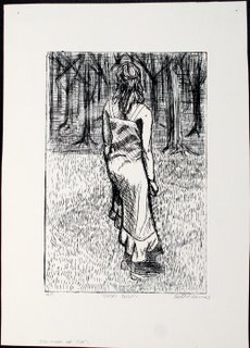
I knew a woman who wave very contemplative (as was I)and since she was willing to model for me I was able to make a few pieces that had a little bit of content to them, thus moving beyond the rudimentary techniques I was using.
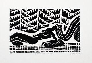

it was a printmaking survey class so we did lots of stuff and spent very little time on any single technique.

but it opened my eyes to how fun (and how seductive) strict black and white could be


I knew a woman who wave very contemplative (as was I)and since she was willing to model for me I was able to make a few pieces that had a little bit of content to them, thus moving beyond the rudimentary techniques I was using.

Subscribe to:
Comments (Atom)

