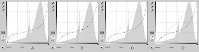
These are the four adjustment curves I made for cyanotype printing. I like "D" the best because it is closest to the original tonal range of my home-made 21 step wedge. It could use a little bit of tweaking, but I can use the information from the other three to adjust the curve to my liking. I can do this because I recorded everything, so have the data needed to make the adjustments.
Click on the images to enlarge them.
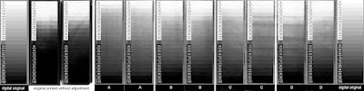
This composite image below shows the original digital 21 step wedge on the ends, and all of the pairs that I made using various adjustment curves. (this image converted to grayscale for comparison to the step wedge; it also has the levels adjusted to get rid of the head/foot in the histogram since the cyan color does not have a great Dmax. It's relative)
Here is the same composite in color.
Original digital image on the ends.
First pair was made with a transparency that did not have any adjustment curve. I simply took the image and hit "control - i" to inverse the image and create a negative, then printed it out on an Epson 3800. Using the transparency/negative to make the cyanotype prints revealed how far off the cyanotype process can be.
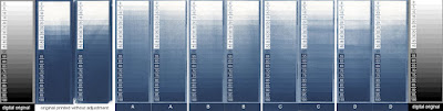
After scanning the cyanotype prints made with the non-adjusted transparency, I recorded the difference between the Input (what the gray density should be) and the Output (what the gray density really is in the process). I reversed the Input/Output numbers to make a compensation curve.
Curve A was made with the information from the original print on the left.
Curve B was made by using Curve A and smoothing it out a bit by clicking the pencil icon then hitting the S shaped icon below it two or three times.
Curve C was made with the information from the original print on the right.
Curve D was made by using Curve C and smoothing it out a bit by clicking the pencil icon then hitting the S shaped icon below it two or three times.
Adjustment curve D applied to this image.
10 minute exposure. Standard water development.
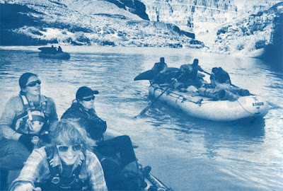
Converted to grayscale mode to see the real tonal range.
(no other adjustment)
This is the original digital image.
Even the darkest prussian blue possible in a cyanotype is not going to have the density of other processes, I think that this is about as good as I can get this process. Since blue reads a little lighter, and is difficult for the eye to see, I am going to make a few prints with longer exposure times. Having 90%, or even 85% drop out all the way to 100% black (blue in this case) would not hurt the image, and would make the tonal scale in the middle drop down to a slightly darker range that will create a more convincing image.
A very brief summary of the entire process:
1. Your workflow must be consistent. If it is not, then address that first.
2. Make a stepwedge (or gray chart) in Photoshop. Flatten the image. Invert it so it is a negative. Print it on a transparency. Use the same printer, print settings, and transparency brand/model every time. If you change one then you have changed your workflow and must start again.
3. Use that transparency/negative to print a cyanotype (or whatever process you are using).
4. Scan the resulting cyanotype with ALL color adjustments off.
5. Use a "Levels" layer to get rid of the "head" and "foot" of the histogram so you are only dealing with the information that exists and not theoretical densities in the digital world.
6. Use the "info" palette to record the difference between Input and Output. Input is what your chart says the number should be. Output is what it is reading in the scan.
7. Reverse the Input & Output numbers to build an adjustment curve.
8. Apply the adjustment curve to your original image. Flatten the image. Inverse the image to make a negative. Print on transparency. Use transparency/negative to make another cyanotype. The result should be a much better tonal range that looks closer to the original image.
A blog is not the right forum for explaining the entire process. There are too many variables. I have almost two years of off and on research into making digital negatives. I will list some of the best resources below. There are others, but the information is scattered (often in incomplete blogs like this one), and wading through some of the mythology can be a real challenge.
The links below will bring you to systems that use solid techniques based much experience. While each persons' system seems different, the core principles are the same.
http://www.digital-negatives.com/
The book and website are probably the best overview of all the concepts needed, and the book has a great set of instructions for the Quadtone RIP system that makes alot of sense.
http://www.inkjetnegative.com/images/RNP/rnp.htm
Is an excellent introduction to how different colors block UV light differently and has a link to an exceptionally useful script called ChartThrob.
http://www.danburkholder.com/Pages/main_pages/book_info_main_page1.htm
Dan's book is older, but the fact that it is still in use is a testament to the accuracy of the information and how straight forward the writing is.
http://www.precisiondigitalnegatives.com/
Mark Nelson has an exceptionally involved system that takes some time to get used to, but it works very well for Platinum printing. In my opinion, it is more involved that you need for processes that have less tonal range than Platinum/Palladium. I have seen some beautiful Platinum/Palladium prints made with this system, so it's worth a look.
http://www.alternativephotography.com/wp/
Lots of information can be found at the Alternative Photography community. They also have a Facebook group with many helpful people.
http://www.apug.org/forums/home.php
The Analog Photography Users Group is another community that has some experienced folks around.
http://www.alternativephotography.com/wp/negatives/digital-negatives-color-ratio
Clay Harmon's color ratio method.
http://glsmyth.com/MiscArticles/Creating_The_Digital_Negative.pdf
Another nice explanation of making digital negatives
http://www.siderotype.com/preview/dig7preview.pdf
Dr. Mike Ware has a wonderfully different approach that relies on moving the center point on the Levels slider, effectively changing the gamma, which is sometimes simpler while simultaneously maintaining great control over the tonal range of your digital negative (without the the need for the intense experimentation/documentation of many of the methods mentioned above)


