Showing posts with label aquatint. Show all posts

Thursday, July 25, 2013

Inking a la squeegee


Multi-color intaglio prints that use only one plate require extra care to prepare, wipe, and print.  Normally this is associated with inking "a la poupee" ("with the doll"), in which each color is applied with small hand-made "dolls" of tarlatan; one for each color.  I prefer to use squeegee cutoffs; whether they are cardboard or plastic.  So, since this water lilly was not prepared with little tarlatan dolls, but with little pieces of squeegee, then I consider it inked "a la squeegee".  


White Water Lily
(nymphaea odorata, nymphaea tuberosa)

Monday, June 11, 2012

Soho Photo


Annual Juried Exhibition
http://www.sohophoto.com/sp_national_comp.htm
will show the photogravure titled "Havasu" (sepia version);
the one that was on display in the DC (Glen Echo Photoworks, MD) show;
the one that won both First Place Alt. Process and People's Choice;
in Rangefinder Magazine's annual B&W competition.
If you find yourself in NYC in July, then stop by to see the show!


Opening Reception
July 5
Thursday, 6pm - 8pm

Show Dates
July 5 - August 4, 2012


Location
Soho Photo
15 White Street
New York, NY 10013

http://www.sohophoto.com/downloads/2012_national_comp_winners.pdf


Thursday, May 17, 2012

Grand Canyon photogravure (so far)

Slideshow.  (if the show does not start in a few seconds, click here)


These are the 12 photogravures that have been editioned in sepia.  (only 10 copies each)  A few of them are editioned in a custom mixed thalo black ink.  My goal for this summer is to finish the thalo black edition and start work on the second batch of 12 plates for this suite.

The entire project is developed enough now that I feel I can start showing it to galleries/dealers, with the qualifier that the series not yet finished.

A few of you already have acquired copies from this suite of prints.  Thank you.  I hope you enjoy the fact that you are the first collectors of this project, and are participating at the earlier stages of it's development.  Your support and feedback are felt and very much appreciated.

(and now a link to a list of printmaking terms for the curious)
http://www.ira.usf.edu/GS/education/printmaking.html

Sunday, April 15, 2012

Elves Chasm (looking out)


Finished the sepia edition (10) from this photogravure plate.
The sky in this picture is a very close portrayal of the typical sky from the trip last year. Overcast much of the time, but when clear the wind kicked up. This all made for some very flat light. Taking pictures within a tight canyon was good, but as soon as I turned the camera lens skyward, the meter did all sorts of crazy things. I had to rely on what I had learned about light meters, exposure, aperture a very long time ago.

Here is a link to a very cool 360 panoramic view of Elves Chasm that someone else made.

Thursday, April 12, 2012

Elve's Chasm (looking in)


I just ran the sepia edition from this photogravure plate.
10 prints in the edition with 1 artist's proof and 1 printer's proof.

Geology of Elve's Chasm

Wednesday, April 11, 2012

Stone Voices

"The ease of digital photography, with its ability to collect thousands of images rapidly, seems as personal as the thousands of "friends" in the online world. My exploration of historical photographic processes have let me slow down and work with images that are like close friends. The photogravure process demands thorough knowledge of several different workflows, most of which are manual, intimate techniques of creating an image. The process is slow, and allows time for me to get to know the image like a good friend. The final steps of inking, wiping, and printing are like a pat on the back, a handshake, and the revelation of something that only a close relationship can give."

I wrote that when I sent my images in to Stone Voices for (hopeful) participation in the "Inspired By Joy" Summer Issue. I like the premise of the art and literary journal, starting with their tag line (mission statement?), "Connecting Art and Spirit". Each issue is a (mostly) juried competition in which visual artists send in their work with a statement, then writers create work based on the journey the visual work inspires. The collaboration is remote, but the connection is real.

Hopefully someone is inspired enough by my work to write something wonderful.

(I don't think that my work has a link off any of the pages yet, but I was playing with Google Images and what do you know?... there they were, waiting to inspire writers who enter the juried competition)

disclaimer (clarification by expansion): I do enjoy digital photography. I participate heavily. My comments are an explanation of WHY I have been drawn to an older process. Slowing down has a different aesthetic than the fast-paced, instant-gratification world that surrounds us. And, I won't say that it is more or less beautiful. It's just that the beauty is different.

Here is the full gallery with all the artists for writers' viewing.

Sunday, April 08, 2012

Tequila Beach


Testing the photogravure plate I just made for this image, using blue black ink on white paper. It looks good, but I think that the edition will use a warmer ink color.

(please excuse the limited range of the cell phone camera used to take the photo of this test print)

http://grandcanyonhistory.clas.asu.edu/sites_coloradorivercorridor_lavafalls.html

Wednesday, March 21, 2012

New York Show & Sale of 19th - 21st Century Photographic Images

Stop by and see my award-winning photogravure and some other VERY nice work photographs from contemporary artists as well as some antique photos.

Saturday, March 31, 2012

at The Lighthouse
111 East 59th Street
New York, NY 10022

http://www.usphotoshows.com/shows_nyc.html

Monday, February 20, 2012

MPLS Photo Center

"Black & White: The Absence of Color"
March 9 - April 22
http://www.mplsphotocenter.com/exhibits/juror_results.php
Opening reception March 9th, 7-10pm


http://www.mplsphotocenter.com/exhibits/exhibits-information.php

photogravure titled "Campsite Quanta"
This is the black & white version
(bone black with a little bit of thalo red mixed in)
There are 10 in this edition and
an edition of 10 in sepia


here is a link to the Flickr stream from the opening reception
http://www.flickr.com/photos/50918001@N05/6836080758/in/set-72157629584141669/

and some more photos of the installation taken without people in front of the art
http://www.flickr.com/photos/50918001@N05/6858467690/in/set-72157629273960916/

Wednesday, June 01, 2011

Photography changes during printing process

Photography has always been full of multiple variables, most of which effect each of the others drastically. Slight changes in printer settings will make the most precise digital output change. Minor chemical variations in traditional (now called "alternative") photography can make a big difference. Same holds true for one of the oldest forms of photography: photogravure.

Look carefully at the two images below.
Same plate.
Same ink.


The process for the top print involved soaking the paper for only 10 minutes, and using a standard three-blanket setup on the etching press. The image has high contrast, some detail loss, and poor transition from light to dark (gradient).

The process for the bottom print was one in which the paper soaked for about an hour, and an extra sheet of printmaking paper was added on top the the paper/plate sandwich to act as a fourth blanket. The gradients are smoother. There are a couple more steps of mid-tone gray. Some very subtle details start to emerge.


I must give credit to Jon Lybrook for reminding me about this subtle, but important, printmaking trick. It was discussed in grad school, but my work at the time was suited for a standard three-blanket set up, so I forgot about the addition of a fourth "blanket" of printmaking paper until Jon mentioned it to me this January (he saw some of my gravure and said, "you know what will even out your tones...")

Note:
in the technical information page (click on Jon's name to get there), he mentions using two pieces of newsprint. When I spoke with him, he suggested using a piece of printmaking paper. I've tried both, and the printmaking paper seems to work better.
I find that I can use the same piece of printmaking paper as the fourth blanket 6 - 10 times before it's too soaked to be effective. I keep a regular rotation of these sheets by letting the wet ones dry, and occasionally stacking them all together and putting weight on top to straighten them out for reuse.

Saturday, May 28, 2011

How To make a plate with photopolymer for safe(er) aquatint printing


(the original drawing was made by Marie Roberts bitterwonder.com)

I'm looking for feedback on this photo sequence.
So you need another photo to make the process clear?
What questions do you have about any photo?
Leave a comment and I'll get back to you (and this will help me fine tune how to teach this process)

Thursday, December 09, 2010

Tuesday, June 08, 2010

Photopolymer Graveur Curves Preview in Photoshop

this is just the beginning (because I am just beginning)...
below is the original digital image collage, converted to grayscale, but otherwise untouched/unadjusted
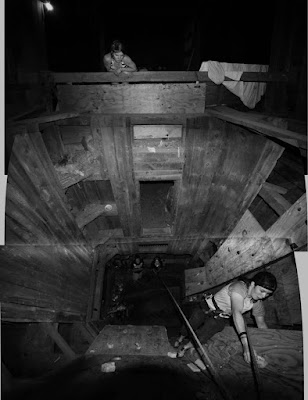
photopolymer graveur (aquatint, "safe" etching, whatever you call it) will drop out values above 80% and below 20%. In other words at those points the value will go right to black or white. So, the grayscale really only runs between the two, in the middle ground, and is not subtle at all towards the end of the scale. (I have been told this is mostly true for the original Photo Graveur, and had to be addressed. Difference in this process is that most of the adjustment is on the computer and not the development process)

I have seen a couple of curves claiming to solve this issue, but they (in my opinion) only work at the cost of some variety in the middle of the scale. I suspect this is because they are trying to bring up values that are not there.

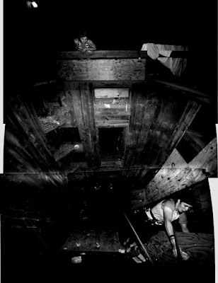
The best thing I have discovered (to date) is the simple idea of getting a reliable preview. No matter how much you adjust your image, it is difficult to guess how much information will be lost. So, when you think you are ready to go, I'd suggest adding on more adjustment layer, and moving the sliders over from 0 to 20, and from 100 to 80. Check out the results...
below is the adjusted image: it is the first (above) image, with the curves adjusted at 20 and 80 as a way for me to preview my results from the polymer plate.

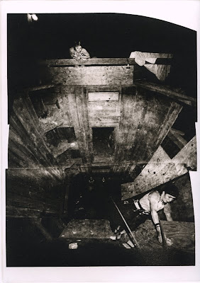
below is the actual printed image from a KM73 photopolymer plate.
There is a bit of information loss in the scan, but this is a pretty representation of what it looks like.

To clarify:

Top image is the original, and the one I printed on a high quality transparency (Pictorico), and used to expose the KM73 photopolymer plate.

Middle image is the top image, with an adjustment layer (Curves) over it, sliders moved from 0 to 20 and from 100 to 80 to get a preview of how the image will look from the KM73 plate, knowing that information is lost above 80 and below 20. It is only a way to get a sort of soft proof, to make sure I am on the right track.
No matter how I adjust the image before printing to the transparency, I want to do this preview before printing to see if it will be satisfactory.
BE SURE TO UNDO THIS STEP BEFORE YOU PRINT!!! It is a preview technique only.

Bottom image is printed from the KM73 polymergraveur plate onto Rives BFK white paper with Graphic Chemical Vine Black etching ink.

Friday, May 07, 2010

plate decisions and editioning

photo (polymer) graveur
digital printout of the composite photo on top
and two choices (two different plates) to help see how it actually prints


Aquatint (polymer)
These 24 prints are the first pass / first color of an edition.
The edition will most likely be 20 or 21, keeping in mind that it will take two or three experiments to get the second color correct.