"Call me Ishmael. Some years ago - never mind how long precisely - having little or no money in my purse, and nothing particular to interest me on shore, I thought I would sail about a little and see the water part of the world. It is a way I have of driving off the spleen, and regulating the circulation. Whenever I find myself growing grim about the mouth; whenever it is a damp, drizzly November in my soul; whenever I find myself involuntarily pausing before coffin warehouses, and bringing up the rear of every funeral I meet; and especially whenever my hypos get such an upper hand of me, that it requires a strong moral principle to prevent me from deliberately stepping into the street, and methodically knocking people's hats off - then, I account it high time to get to sea as soon as I can. This is my substitute for pistol and ball. With a philosophical flourish Cato throws himself upon his sword; I quietly take to the ship. There is nothing surprising in this. If they but knew it, almost all men in their degree, some time or other, cherish very nearly the same feelings toward the ocean with me.
There now is your insular city of the Manhattoes, belted round by wharves as Indian isles by coral reefs - commerce surrounds it with her surf. Right and left, the streets take you waterward. Its extreme down-town is the battery, where that noble mole is washed by waves, and cooled by breezes, which a few hours previous were out of sight of land. Look at the crowds of water-gazers there.
Circumambulate the city on a dreamy Sabbath afternoon. Go from Corlears Hook to Coenties Slip, and from thence, by Whitehall, northward. What do you see? - Posted like silent sentinels all around the town, stand thousands upon thousands of mortal men fixed in ocean reveries. Some leaning against the spiles; some seated upon the pier-heads; some looking over the bulwarks of ships from China; some high aloft in the rigging, as if striving to get a still better seaward peep. But these are all landsmen; of week days pent up in lath and plaster - tied to counters, nailed to benches, clinched to desks. How then is this? Are the green fields gone? What do they here?
But look! here come more crowds, pacing straight for the water, and seemingly bound for a dive. Strange! Nothing will content them but the extremest limit of the land; loitering under the shady lee of yonder warehouses will not suffice. No. They must get just as nigh the water as they possibly can without falling in. And there they stand - miles of them - leagues. Inlanders all, they come from lanes and allys, streets and avenues - north, east, south, and west. yet here they all unite. Tell me, does the magnetic virtue of the needles of the compasses of all those ships attract them thither?
Once more. Say, you are in the country; in some high land of lakes. Take almost any path you please, and ten to one it carries you down in a dale, and leaves you there by a pool in the stream. There is magic in it. Let the most absent-minded of men be plunged in his deepest reveries - stand that man on his legs, set his feet a-going, and he will infallibly lead you to water, if water there be in all that region. Should you ever be athirst in the great American desert, try this experiment, if you caravan happen to be supplied with a metaphysical professor. Yes, as every one knows, meditation and water are wedded for ever.
But here is an artist. he desires to paint you the dreamiest, shadiest, quietest, most enchanting bit of romantic landscape in all the valley of the Saco. What is the chief element he employs? There stand his trees, each with a hollow trunk, as if a hermit and a crucifix were within; and here sleeps his meadow ,and there sleep his cattle; and up from yonder cottage goes a sleepy smoke. Deep into distant woodlands winds a mazy way, reaching to overlapping spurs of mountains bathed in their hill-side blue. But though the picture lies thus tranced, and though this pine-tree shakes down its sighs like leaves upon this shepherd's head, yet all were vain, unless the shepherd's eye were fixed upon the magic stream before him. "
pp. 1 -3
Moby Dick or The Whale
by Herman Melville
Wednesday, June 09, 2010
Tuesday, June 08, 2010
Photopolymer Graveur Curves Preview in Photoshop
this is just the beginning (because I am just beginning)...
below is the original digital image collage, converted to grayscale, but otherwise untouched/unadjusted
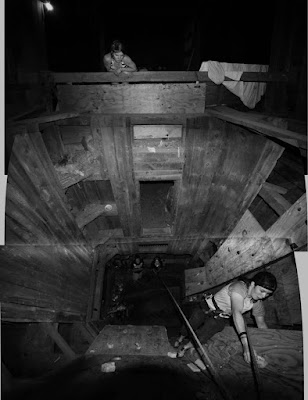
photopolymer graveur (aquatint, "safe" etching, whatever you call it) will drop out values above 80% and below 20%. In other words at those points the value will go right to black or white. So, the grayscale really only runs between the two, in the middle ground, and is not subtle at all towards the end of the scale. (I have been told this is mostly true for the original Photo Graveur, and had to be addressed. Difference in this process is that most of the adjustment is on the computer and not the development process)
I have seen a couple of curves claiming to solve this issue, but they (in my opinion) only work at the cost of some variety in the middle of the scale. I suspect this is because they are trying to bring up values that are not there.
The best thing I have discovered (to date) is the simple idea of getting a reliable preview. No matter how much you adjust your image, it is difficult to guess how much information will be lost. So, when you think you are ready to go, I'd suggest adding on more adjustment layer, and moving the sliders over from 0 to 20, and from 100 to 80. Check out the results...
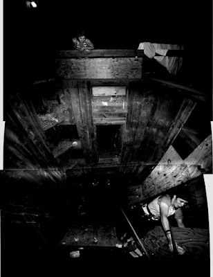
below is the adjusted image: it is the first (above) image, with the curves adjusted at 20 and 80 as a way for me to preview my results from the polymer plate.
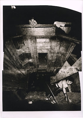
below is the actual printed image from a KM73 photopolymer plate.
There is a bit of information loss in the scan, but this is a pretty representation of what it looks like.
To clarify:
Top image is the original, and the one I printed on a high quality transparency (Pictorico), and used to expose the KM73 photopolymer plate.
Middle image is the top image, with an adjustment layer (Curves) over it, sliders moved from 0 to 20 and from 100 to 80 to get a preview of how the image will look from the KM73 plate, knowing that information is lost above 80 and below 20. It is only a way to get a sort of soft proof, to make sure I am on the right track.
No matter how I adjust the image before printing to the transparency, I want to do this preview before printing to see if it will be satisfactory.
BE SURE TO UNDO THIS STEP BEFORE YOU PRINT!!! It is a preview technique only.
Bottom image is printed from the KM73 polymergraveur plate onto Rives BFK white paper with Graphic Chemical Vine Black etching ink.
below is the original digital image collage, converted to grayscale, but otherwise untouched/unadjusted

photopolymer graveur (aquatint, "safe" etching, whatever you call it) will drop out values above 80% and below 20%. In other words at those points the value will go right to black or white. So, the grayscale really only runs between the two, in the middle ground, and is not subtle at all towards the end of the scale. (I have been told this is mostly true for the original Photo Graveur, and had to be addressed. Difference in this process is that most of the adjustment is on the computer and not the development process)
I have seen a couple of curves claiming to solve this issue, but they (in my opinion) only work at the cost of some variety in the middle of the scale. I suspect this is because they are trying to bring up values that are not there.
The best thing I have discovered (to date) is the simple idea of getting a reliable preview. No matter how much you adjust your image, it is difficult to guess how much information will be lost. So, when you think you are ready to go, I'd suggest adding on more adjustment layer, and moving the sliders over from 0 to 20, and from 100 to 80. Check out the results...
below is the adjusted image: it is the first (above) image, with the curves adjusted at 20 and 80 as a way for me to preview my results from the polymer plate.

below is the actual printed image from a KM73 photopolymer plate.
There is a bit of information loss in the scan, but this is a pretty representation of what it looks like.

To clarify:
Top image is the original, and the one I printed on a high quality transparency (Pictorico), and used to expose the KM73 photopolymer plate.
Middle image is the top image, with an adjustment layer (Curves) over it, sliders moved from 0 to 20 and from 100 to 80 to get a preview of how the image will look from the KM73 plate, knowing that information is lost above 80 and below 20. It is only a way to get a sort of soft proof, to make sure I am on the right track.
No matter how I adjust the image before printing to the transparency, I want to do this preview before printing to see if it will be satisfactory.
BE SURE TO UNDO THIS STEP BEFORE YOU PRINT!!! It is a preview technique only.
Bottom image is printed from the KM73 polymergraveur plate onto Rives BFK white paper with Graphic Chemical Vine Black etching ink.
Thursday, May 27, 2010


Wednesday, May 26, 2010


Tuesday, May 25, 2010
a better look
there are about 10 of these in the edition

only one of these
the rest (which are at this state right now) will get another plate/color on top of the existing image
so I guess, technically, this is a monoprint


only one of these
the rest (which are at this state right now) will get another plate/color on top of the existing image
so I guess, technically, this is a monoprint

Wednesday, May 19, 2010
Variety in three Editions
since this is pretty new and experimental (at least to me) I've been starting small editions from one plate then having to move on to other things, leaving the paper to rebound. Therefore, when resoaked, it stretches differently and makes registration of the next plate next to impossible.
I did a run of about 12, matching the same sized second plate as best as possible. (image on right)
Next, I cut down that second plate, changed the ink color and ran an edition of 10. (image in center)

I liked the play with overlap and small shift in scale, so decided to cut the plate on the next run with a bigger edition of 20. (image on left)
A note about this last image... the line drawing plate was the one that was cut down and printed second; the opposite of the other two images. The larger "background" color does recede because of the design, but the scale of the two plates makes it appear to advance a bit. I enjoy the slight confusion between scale and overlap.
(working paper size is 11" x 15")
There is one more plate that will get involved with this series.
I think I may leave one of the editions as it is now, but the other two will get at least one more color.
and just a fun photo showing plates in post exposure to make sure they are fully cured...

Monday, May 17, 2010
Photopolymer Aquatint Grayscale test prints
Wanting to see the difference between thin plates (from Takach Press the KM Photopolymer plate is .017" thick) and medium thickness plates (from Boxcar Press the KM 73 Photopolymer plate is .030" thick ), thinking that the thicker plates might have a more forgiving and fuller grayscale range.
Also wanted to see how much darker a shorter exposure would be.
Here are all the images in order of printing. (number and info is below each image)

image #3 from KM photopolymer plate from Takach Press
10' stocastic screen aquatint exposure and 10' image exposure

image #5 from KM photopolymer plate from Takach Press
10' stocastic screen aquatint exposure and 8' image exposure

image #7 from KM photopolymer plate from Takach Press
10' stocastic screen aquatint exposure and 6' image exposure

image #9 from KM73 photopolymer plate from Boxcar Press
10' stocastic screen aquatint exposure and 10' image exposure

image #11 from KM73 photopolymer plate from Boxcar Press
10' stocastic screen aquatint exposure and 8' image exposure

image #13 from KM73 photopolymer plate from Boxcar Press
10' stocastic screen aquatint exposure and 6' image exposure

image #15 from KM73 photopolymer plate from Boxcar Press
10' stocastic screen aquatint exposure and 5' image exposure
Friday, May 07, 2010
plate decisions and editioning
photo (polymer) graveur
digital printout of the composite photo on top
and two choices (two different plates) to help see how it actually prints

Aquatint (polymer)
These 24 prints are the first pass / first color of an edition.
The edition will most likely be 20 or 21, keeping in mind that it will take two or three experiments to get the second color correct.

Tuesday, April 27, 2010
water based etching
with photopolymer plates
8.25" x 11.5"

this first plate, line drawing, will stay black
but I'm not sure if it goes down first, or after the second plate is printed

this will be some kind of blue or green

this one will be on top of it all, in white
8.25" x 11.5"

this first plate, line drawing, will stay black
but I'm not sure if it goes down first, or after the second plate is printed
this will be some kind of blue or green

this one will be on top of it all, in white
Thursday, April 22, 2010
Solarplate etching
technically, the plates I used are KM photopolymer plates
http://www.takachpress.com/access/tyobo.htm
the solarplate brand is also available from Takach Press
I'll have to try those as well

Encouraged by good results on Monday night, I went back to the exposure unit and made four plates.
The top one is inked with Charbonnel Etching Concentrated Blue. The range in the plate is good. I think I will change the color since this is the first plate to be printed, and with be the background. (probably some kind of green) I also will experiment with a couple of different off-white and ochre papers.

I decided to test the rest of the plates with black, to make sure I would get the saturation I wanted in a color plate. Testing with black ink on white paper makes judging value very easy. And, if the color is not working out later, at least I know its an ink problem and not a plate problem.
This one will be some kind of lighter blue, and fairly transparent.

This is the main image. It will remain black. No matter how subtle I can get the aquatint, I still have a preference for some kind of strong-handed graphic-looking image in the picture.
Technically, this is still an aquatint style plate. That just allows any width line that I want. I am pleasantly surprised by the variety of line I can get, from super delicate, almost disappearing, to very bold.

This last plate is going to be the top layer of ink. It will be a transparent white. (the black part will be white, so you have to image this image in reverse)
Since everything underneath will be a dark or middle value, (and the paper is not white) I'm curious how transparent the white will have to be. Much of the underlying image may already show through with very little transparent base mixed into the white.
Subscribe to:
Posts (Atom)